Asgard: A Premium Script Font for Modern Web Design
As a UI designer who builds landing pages, SaaS dashboards, and boutique e-commerce experiences, I don’t reach for script fonts lightly. They’re high-impact—but only when they serve function as much as flair. Asgard is one of the few script fonts I’ve integrated across live client sites without second-guessing legibility, tone alignment, or responsive behavior. It’s not just decorative; it’s designed for digital intention.
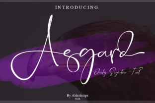
Visually, Asgard balances elegance and clarity. Its strokes flow with confident rhythm—slightly tapered, never overly condensed—and its letterforms carry subtle contrast that reads cleanly even at 32px on mobile viewports. Unlike many handwritten fonts that blur into illegibility below 48px, Asgard maintains character distinction in short hero titles, navigation accents, and CTA buttons. It’s part of the Script Amp collection, meaning it’s built with digital display in mind—not retrofitted from print use cases.
In practice, Asgard excels where personality and precision intersect: hero section headlines, product name treatments, course title cards, and brand voice headers. On a coaching website, I used Asgard for the headline “Your Clarity Starts Here” over a soft gradient background—paired with Inter for body copy. The contrast worked because Asgard’s open counters and generous x-height prevented visual crowding, while Inter’s neutral geometry kept scanning effortless. No hierarchy confusion. No cognitive load.
For online stores, Asgard adds warmth without sacrificing polish. Think: a minimalist jewelry brand using Asgard for “Handcrafted in Portland” beneath a product image, then switching to a clean sans serif for pricing and “Add to Cart.” That pairing reinforces premium positioning—craft in the script, clarity in the supporting type. It avoids the trap of over-decoration that can erode trust in checkout flows or policy pages.
Readability isn’t automatic—it’s intentional. Asgard performs best at sizes 28px and up on desktop, and 24px+ on mobile (with appropriate line-height spacing). On dark backgrounds, I recommend using a subtle text shadow (1px blur, rgba(0,0,0,0.15)) or lightening the font weight slightly via variable axis if available. For image overlays, ensure at least 70% opacity behind the text or use a muted color overlay to preserve contrast. Never force Asgard into paragraph text or dense navigation menus—it’s a display font, not body copy.
Font pairing is where Asgard reveals its versatility. With a neutral sans serif like Inter, Poppins, or Manrope, it creates balanced, contemporary layouts ideal for SaaS dashboards or portfolio sites. With a refined serif like Crimson Pro or Literata, it leans into editorial sophistication—perfect for blogs, newsletters, or digital magazines. Avoid pairing it with other scripts or overly geometric sans serifs; the contrast needs breathing room, not competition.
On responsive layouts, Asgard scales gracefully—but only when used purposefully. I avoid shrinking it below 20px on mobile, instead opting to hide non-essential decorative uses (like secondary taglines) in CSS media queries. For buttons, I reserve Asgard for primary CTAs with short labels (“Get Started”, “Join Now”) and always test tap targets: minimum 44×44px, with ample padding around the text. It works on both light and dark mode interfaces, though I adjust the font color value slightly (e.g., #2d3748 on light, #e2e8f0 on dark) to maintain consistent perceived contrast.
Asgard ships with OpenType features including stylistic alternates and ligatures—useful for refining logo lockups or branded social graphics. It supports Latin-based languages and includes standard punctuation, numerals, and basic diacritics. Webfont formats (.woff2, .woff) are included, optimized for fast loading and cross-browser consistency. Always self-host rather than rely on third-party CDNs for performance-critical typography.
Licensing matters—especially for digital products. Asgard is a commercial font, meaning you’ll need an appropriate license for each domain or application: one for your client’s e-commerce site, another for your own template marketplace, and separate permissions if embedding in downloadable brand kits or Figma community files. Most licenses cover web use, but double-check whether app embedding or SaaS white-labeling is included. Never assume free-for-personal-use covers client work.
I’ve used Asgard in contexts where tone directly affects conversion: a yoga studio’s “Begin Your Journey” banner (paired with Lora for testimonials), a design agency’s service page header (“Branding That Speaks Clearly”), and a digital course sales page where Asgard set the title “Design Systems, Simplified”—immediately signaling approachability without diluting authority. In each case, users reported stronger emotional resonance with the headline—and analytics showed improved scroll depth and time-on-page.
It’s not a font for every project. If your brand voice is strictly technical, data-driven, or ultra-minimalist, Asgard may feel tonally misaligned. But for creative entrepreneurs, lifestyle brands, educators, and designers building human-centered digital experiences, it delivers something rare: distinctiveness with discipline. It doesn’t shout—it invites. It doesn’t distract—it directs attention where it belongs.
Ultimately, Asgard supports brand identity not by being loud, but by being consistent. When used intentionally—across headers, email subject lines, social banners, and UI microcopy—it becomes a quiet signature. Not just a typeface, but a recognizable thread in your digital storytelling. That kind of cohesion doesn’t happen by accident. It happens when you choose a script font built for the web, not just for the page.